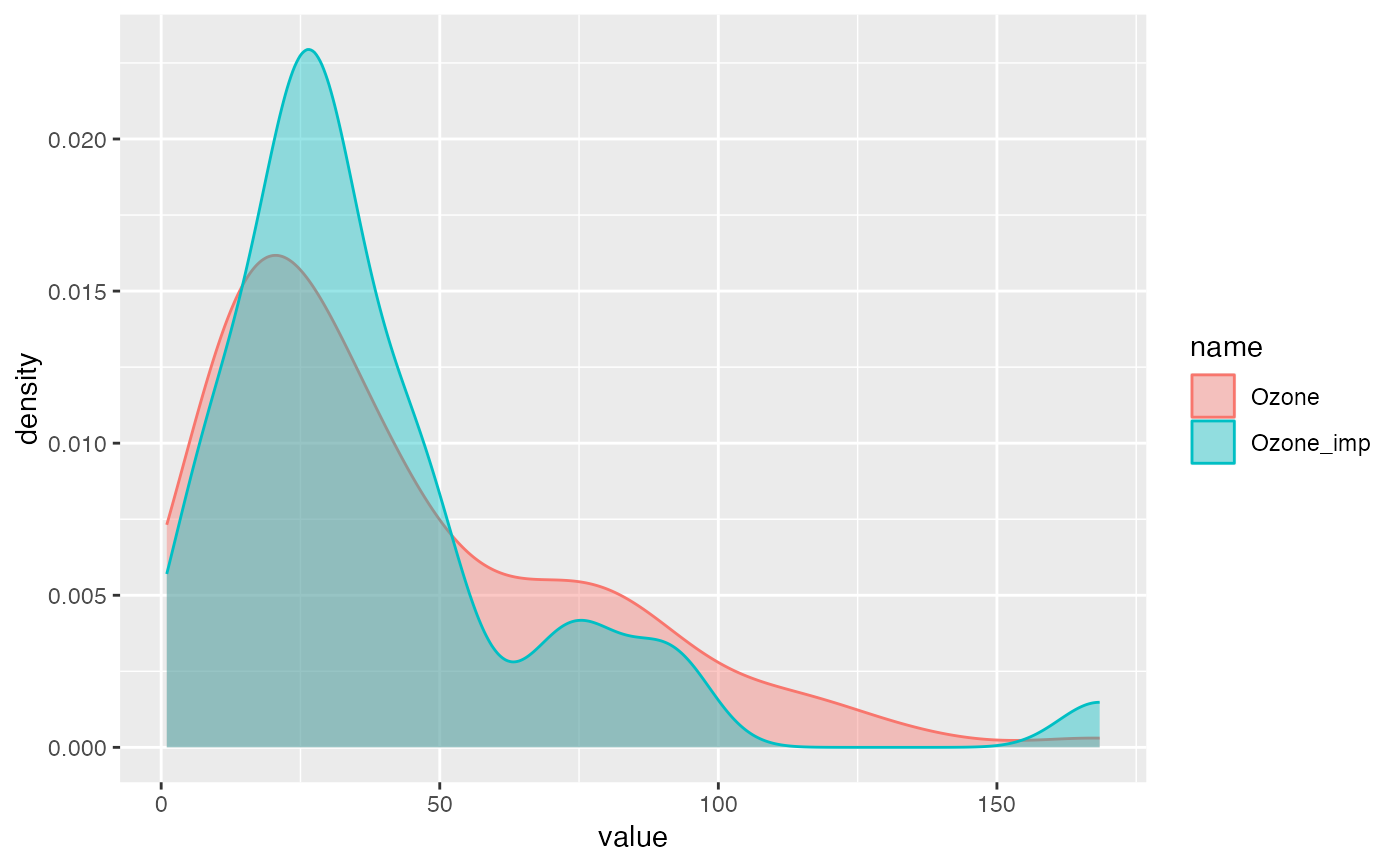
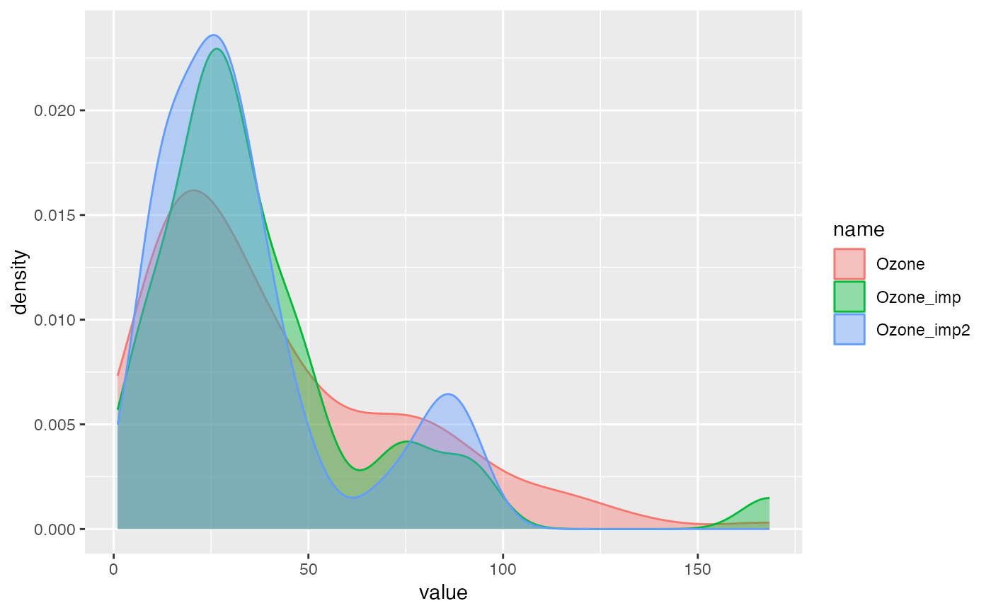
ggplot2 visualization to support which imputation method to choose
compare_imp(df, origin, target)Arguments
Value
ggplot2 object
Examples
library(miceFast)
library(ggplot2)
data(air_miss)
air_miss$Ozone_imp <- fill_NA(
  x = air_miss,
  model = "lm_bayes",
  posit_y = 1,
  posit_x = c(4, 6),
  logreg = TRUE
)
air_miss$Ozone_imp2 <- fill_NA_N(
  x = air_miss,
  model = "pmm",
  posit_y = 1,
  posit_x = c(4, 6),
  logreg = TRUE
)

compare_imp(air_miss, origin = "Ozone", "Ozone_imp")

compare_imp(air_miss, origin = "Ozone", c("Ozone_imp", "Ozone_imp2"))
